Work Hours
Monday to Friday: 9AM - 6PM
Weekend: Closed


In a world where digital-first impressions are everything, a B2B website is more than a digital business card – it's a high-stakes platform that can drive leads, build trust, and directly impact growth. Yet many businesses still underestimate the role of user experience (UX) in achieving those outcomes. A poorly designed website can confuse visitors, erode credibility, and stop conversions in their tracks. On the other hand, a thoughtful UX strategy can turn casual visitors into engaged prospects and eventually, loyal clients.
In this guide, we’ll walk through the UX best practices for B2B websites that are designed to drive conversions, build trust, and boost organic engagement.
Why UX Matters for B2B Websites
While product quality, pricing, and reputation still matter, the website experience often forms the first meaningful interaction a potential buyer has with a business. Unlike casual consumers, B2B decision-makers tend to be more analytical and risk-averse, often involving multiple stakeholders in the buying process. This makes their user journey longer and more sensitive to friction.
A clean, intuitive UX can:
- Encourage longer time on site
- Lower bounce rates
- Increase engagement with key content
- Boost trust and credibilit
- Improve lead generation through clear conversion paths
Simply put, better UX leads to better business outcomes. It also aligns with SEO best practices and search engines favor websites that offer strong usability, fast loading speeds, and mobile responsiveness.
Conversion-Focused Layouts That Actually Work
Your layout is the foundation of the user experience. It guides the visitor's attention, determines how they interact with your content, and influences whether they take action or bounce away.
Key Layout Principles for B2B Sites:
- Above-the-Fold Clarity: The moment a visitor lands, they should immediately understand who you are, what you offer, and how it benefits them. A strong headline, subheadline, and CTA in the first screen view can make all the difference.
- Visual Hierarchy: Structure your content using size, color, and spacing to emphasize key points. Headings, subheadings, icons, and section breaks help users scan and find relevant info fast.
- Logical Content Flow: Use a Z-pattern or F-pattern layout to align with how users typically read web content. Start with high-level messaging, then lead into features, case studies, and calls to action.
- Sticky Navigation: A persistent header with quick-access links to core services, resources, and contact options makes it easier for users to explore without friction.
Bonus Tip: Avoid clutter. Each page should have a singular focus with one or two CTAs. Trying to be everything to everyone results in decision fatigue and lower conversions.
Trust-Building UI Elements
Trust is the currency of B2B sales. A slick interface might grab attention, but it's the subtle signals of credibility and professionalism that truly convert visitors into leads.
Must-Have Trust Signals:
- Security Features: Use HTTPS, display trust badges, and link to privacy policies and terms of service. These are simple yet essential signals for risk-conscious buyers.
- Client Testimonials & Case Studies: Social proof is powerful. A few well-placed testimonials, success metrics, and detailed case studies can demonstrate real-world results and instill confidence.
- Certifications, Awards & Associations: Highlighting industry certifications or awards not only reinforces your expertise but can differentiate you in a crowded field.
- Consistent, Professional Visuals: UI should align with your brand: clean, modern, and intentional. Avoid stock overload or outdated color schemes. Visual consistency shows attention to detail and that reflects on your services.
- Fast Load Speeds & Mobile Optimization: Speed and responsiveness aren't just UX factors—they’re trust builders. A slow or glitchy site makes visitors question the reliability of your business.
Clear and Actionable CTAs
Even if your content is strong and your design is slick, a weak or vague Call-to-Action (CTA) can kill conversions.
Your CTA should:
- Be clear about what happens next
- Offer real value or incentive
- Align with the visitor’s stage in the decision-making process
Strong B2B CTA Examples:
- Schedule Your Free Consultation
- Download the Full Case Study
- Get a Custom Quote
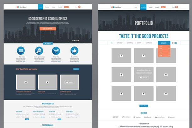
- See Our Portfolio
CTA Placement Best Practices:
- Above the fold for immediate action
- Mid-page after listing benefits or explaining your services
- End of page to reinforce the next step after full engagement
Make your CTAs visually distinct using color contrast, whitespace, and concise button text. Avoid cluttering the page with too many options; guide users toward the single action that drives your goals.
Optimizing UX for Mobile Users

Many B2B buyers use their mobile devices for research—whether during commutes, in meetings, or after hours. A desktop-only experience won’t cut it.
Mobile UX Essentials:
- Responsive layouts that adapt to all screen sizes
- Clickable elements that are thumb-friendly
- Easy access to contact forms and service pages
- Optimized fonts and button sizes
- Fast loading via image compression and code minification
Improving mobile UX also supports Core Web Vitals, which directly influence your SEO ranking.
Real-World UX in Action: B2B Website Example Scenarios
Let’s consider a few practical scenarios that illustrate strong UX in B2B environments:
Example 1: A SaaS Company Homepage
- Above-the-fold value proposition with CTA: Book a Demo
- Scannable benefits section with icons
- Trust badges and logos from existing clients
- Video testimonials embedded mid-page
- Sticky contact form or live chat in the bottom-right corner
Example 2: A Digital Marketing Agency Service Page
- Service headline + outcome-focused subheadline
- Short bullet list of deliverables
- Case study snippet and CTA: “See the Full Results
- FAQ section addressing buyer concerns
- Final CTA: “Schedule Your Strategy Call
These layouts make it easy for visitors to understand what’s offered, how it helps them, and what to do next.
Quick UX Optimization Checklist for B2B Sites
Here’s a summary list to reference when auditing or designing your B2B website UX:
- Clear value proposition above the fold
- Visual hierarchy that guides the eye
- Fast load speeds and mobile responsiveness
- Case studies, testimonials, and client logos
- Consistent branding and clean design
- Strategic placement of actionable CTAs
- Navigation that’s intuitive and accessible
- Clear privacy policies and secure browsing
- Optimized layouts for every stage of the buyer journey
Conclusion
Investing in UX isn’t just a design decision—it’s a business strategy. In B2B, where buying cycles are longer and stakes are higher, your website must guide, inform, and convert with clarity and confidence. By focusing on conversion-friendly layouts, trust-building UI, and clear CTAs, businesses can transform their digital presence into a lead-generating machine.
Need help optimizing your website's UX? Schedule a free consultation with our team to get started.