Work Hours
Monday to Friday: 9AM - 6PM
Weekend: Closed

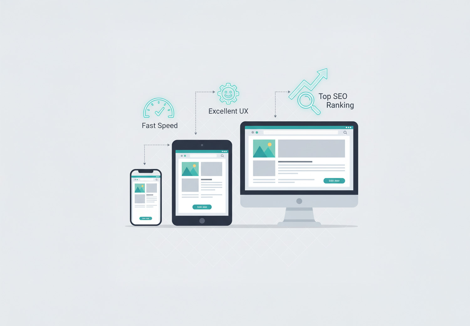
In today's digital-first environment, optimizing your website for mobile users is no longer optional—it's essential. With a majority of traffic now coming from smartphones and tablets, your website’s mobile experience directly affects everything from user engagement to search engine rankings and conversions.
In this guide, we’ll walk you through how to create a mobile-friendly website that supports better SEO, improved user experience, and higher lead generation. Whether you're managing an eCommerce platform, professional services site, or content-driven business, this step-by-step guide will help you meet both user expectations and search engine requirements.
What is Mobile-First Indexing?
Mobile-first indexing means Google predominantly uses the mobile version of your website for indexing and ranking in its search results. Instead of evaluating your desktop site first, the search engine bots now check how your mobile content performs—this includes design, load time, user experience, and technical structure.
This approach aligns with user behavior trends, as most visitors now browse and interact via mobile devices. If your website isn’t optimized for these users, you risk falling behind in visibility and conversions.
It’s crucial to ensure that the mobile version of your website contains the same essential content, meta tags, and structured data as the desktop version. Otherwise, what Google sees (and ranks) may not reflect your most valuable offerings.
Tip: Use Google’s Mobile-Friendly Test Tool to check if your site is mobile-optimized.
Why Mobile Optimization is Critical for SEO and Lead Generation
A mobile-optimized website isn't just a matter of convenience—it's a competitive advantage. Here’s why it matters:
- SEO Rankings: Google officially treats mobile usability as a ranking factor. A poor mobile experience can lead to lower search visibility.
- User Engagement: Mobile users expect fast, smooth, and intuitive browsing. If your site doesn’t deliver, bounce rates increase and trust declines.
- Lead Generation: Whether it’s filling out a form or making a purchase, users are more likely to convert when they have a frictionless experience on mobile.
- Local Discovery: Mobile optimization supports local SEO efforts, especially important for businesses that rely on location-based traffic.
In essence, mobile optimization bridges the gap between discovery and action, helping turn organic traffic into real results.
Step-by-Step: How to Optimize Your Website for Mobile Users
Let’s dive into actionable steps you can implement right now:
1. Ensure Responsive Web Design
Responsive design automatically adjusts the layout of your website based on the screen size and resolution. Unlike maintaining separate mobile and desktop URLs, responsive websites are easier to manage and more SEO-friendly.
Best Practices:
- Use flexible grids and layouts that adapt to different devices.
- Leverage CSS media queries to define breakpoints for various screen sizes.
- Test how your design responds to portrait and landscape modes on phones and tablets.
Checklist: Ensure images, buttons, forms, and text scale fluidly across screen sizes without breaking layout or content.
2. Improve Mobile Page Load Speed
Page speed is a direct ranking factor, and even more critical on mobile. A one-second delay in load time can reduce conversions by up to 20%.

Ways to Speed Up Your Mobile Site:
- Compress images using modern formats like WebP or AVIF.
- Implement lazy loading for below-the-fold content.
- Minify and defer unnecessary JavaScript and CSS.
- Use a lightweight mobile-friendly caching strategy.
- Host fonts and resources locally where possible.
Run your website through Google PageSpeed Insights to identify slow-loading components.
3. Use Mobile-Friendly Fonts, Buttons, and Tappable Elements
Text that looks fine on a desktop may appear tiny or unreadable on a mobile screen. Likewise, touch navigation requires finger-friendly elements.
UX Tips:
- Use fonts of at least 16px for body text.
- Maintain spacing around clickable elements (at least 48px x 48px).
- Avoid hover-only interactions—mobile users need visible tap options.
Design with thumb zones in mind to ensure intuitive interaction on mobile devices.
4. Simplify Mobile Navigation
Mobile users have shorter attention spans and less space to work with. A cluttered or confusing menu can lead to quick exits.
Navigation Tips:
- Use hamburger menus to consolidate navigation.
- Limit the number of menu items and prioritize key pages (Home, Services, Contact).
- Add sticky headers with essential calls-to-action or menu shortcuts.
A smooth mobile menu encourages deeper site exploration and longer session durations.
5. Avoid Intrusive Popups and Interstitials
Aggressive or poorly timed popups can frustrate users and damage rankings. Google penalizes sites with intrusive interstitials that block content on mobile.
Instead:
- Use small, slide-in banners or exit-intent popups.
- Display popups only after user interaction (e.g., after scrolling 50%).
- Ensure users can easily close the popup without zooming or searching for a small “X”.
Maintain accessibility and content-first design as your guiding principles.
6. Prioritize Content Hierarchy
Mobile screens show less content at once, so layout decisions matter even more.
Tips for Better Readability:
- Keep important content and CTAs above the fold.
- Use bullet points and subheadings to improve scan-ability.
- Break long paragraphs into smaller chunks.
Consider collapsible sections for FAQs or in-depth content to keep users engaged without overwhelming them.
7. Optimize Forms for Mobile Conversion
Forms are a critical part of lead generation. However, many businesses lose mobile leads due to poor form design.

Form Optimization Checklist:
- Stick to single-column layouts.
- Use large input fields and checkboxes.
- Enable auto-fill and input type (e.g., number, email, date).
- Limit the number of fields to essential information only.
A mobile-friendly form can dramatically increase the number of users who complete an action.
8. Test Your Website on Real Devices
Emulators and browser tools can help, but nothing replaces real-device testing. What looks good on your desktop might fail on a real iPhone or Android.
What to Test:
- Loading time and speed
- Menu functionality
- Forms, buttons, and CTAs
- Image scaling and resolution
- Font sizes and line spacing
Use tools like BrowserStack or perform manual checks on the most common devices and screen sizes used by your audience.
Top Tools for Mobile Optimization and Monitoring
Here are the tools every business should use to ensure ongoing mobile performance:
- Google Mobile-Friendly Test: Checks whether your page meets mobile usability standards.
- Google Search Console: Mobile usability report pinpoints page-level issues.
- Google PageSpeed Insights: Provides mobile performance scores and suggestions.
- BrowserStack / CrossBrowserTesting: Real-device emulation and testing.
- Hotjar (Mobile Session Recording): Visualize mobile user behavior with heatmaps.
Regular audits can prevent performance issues from compounding over time.
Mobile UX Practices That Help SEO
Integrating great user experience into your mobile site pays off in both rankings and conversions.
- Use click-to-call buttons for immediate customer contact.
- Localize content and calls-to-action where possible.
- Add mobile-optimized schema markup (e.g., FAQs, Local Business).
- Ensure consistency across mobile and desktop versions of your site.
Great UX leads to longer sessions, lower bounce rates, and better organic rankings.
Mobile Optimization Mistakes to Avoid
Even with the right tools, many websites fall short due to common missteps:
- Hiding content or CTAs on mobile view
- Using desktop-sized popups or overlays
- Inconsistent navigation across pages
- Relying on outdated mobile frameworks
- Failing to test changes on actual devices
Avoiding these pitfalls can protect your SEO performance and user retention.
Final Checklist: Is Your Website Mobile-Ready?
- Site loads in under 3 seconds
- Responsive design adapts to all screen sizes
- Buttons and CTAs are thumb-friendly
- Content is easy to read and navigate
- Forms are short and functional
- No intrusive popups blocking content
- Mobile and desktop versions share the same core content
If you checked most of the boxes above, you're on the right track. If not, it's time to take action.
Conclusion
With mobile-first indexing now the norm, optimizing your website for mobile users isn’t just an SEO tactic—it’s a growth strategy. From page speed and design to UX and content hierarchy, every element plays a role in how users engage and how search engines evaluate your site.
Looking for expert help in improving your website’s mobile performance?
Whether you're looking to boost search rankings, improve lead generation, or just deliver a better user experience, our team is ready to help you stay ahead in a mobile-first world. Contact us for a free mobile SEO audit and strategy session.