Work Hours
Monday to Friday: 9AM - 6PM
Weekend: Closed

When it comes to digital marketing, getting traffic is only half the job—turning those visitors into paying customers is the real challenge. That’s why the most successful websites don’t rely on guesswork or aesthetics alone. They rely on psychology-backed design choices that guide users toward a specific action. Whether you're an SMB, a rapidly growing startup, an eCommerce brand, or an enterprise targeting customers across the USA, understanding the psychology behind high-converting landing pages can dramatically improve your conversion rates and overall ROI.
From color theory and layout structure to CTA placement and user behavior patterns, every element plays a psychological role in determining whether a visitor clicks, buys, or leaves. This blog breaks down the science behind landing page design and gives you actionable strategies to create pages that motivate users to convert.
Why Psychology Matters in Landing Page Conversions
Every landing page is created with a goal—signups, purchases, form submissions, demo bookings, or downloads. But users don’t take action simply because those elements exist. They act based on emotions, expectations, trust, and perceived value.
Behavioral psychology reveals that humans make emotional decisions first and rationalize them later. This makes psychological design incredibly powerful for digital marketing.
A landing page optimized with persuasion principles can help:
- Reduce decision-making friction
- Build instant trust
- Capture attention faster
- Increase lead form submissions
- Improve ad campaign ROI
- Boost conversion rates without increasing traffic
When your landing page aligns with how users think and behave, you create a smoother, more intuitive experience—leading to higher conversions and improved customer satisfaction.
Understanding User Behavior: The Foundation of UI/UX Decisions

Before designing any landing page, you must understand how visitors consume online content. Most users don’t read—they scan. This scanning behavior follows predictable psychological patterns that smart UI/UX teams use to guide attention.
The F-Pattern & Z-Pattern
Eye-tracking studies show that users often read pages in an “F” shape on content-heavy pages and a “Z” shape on simple layouts. This means your most important elements (headline, CTA, value proposition) should appear where the eye naturally lands.
Hick’s Law
The more choices a user has, the longer it takes to decide—often leading to no decision at all. This is why high-converting landing pages prioritize one clear goal and remove unnecessary distractions.
Cognitive Load Theory
Users leave when a page feels overwhelming or difficult to understand. Minimalism, simple fonts, clear spacing, and concise copy help reduce cognitive stress and increase conversions.
Visual Hierarchy
Your landing page should guide the eye from most important to least important content. Hierarchy is created using:
- Size
- Color
- Spacing
- Placement
- Contrast
By understanding user behavior, businesses can make UI decisions that align with natural browsing habits—making conversion more likely.
The Role of Color Psychology in High-Converting Landing Pages
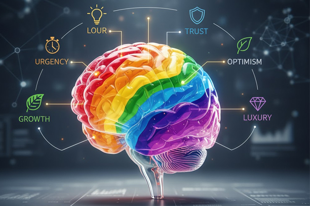
Color isn’t just aesthetic—it influences emotion and action. In fact, research shows that color increases brand recognition by up to 80% and impacts buyer decisions significantly.
Here’s how color psychology impacts conversions:
Blue = Trust & Stability – Commonly used by tech, finance, and SaaS companies to build credibility.
Red = Urgency & Excitement – Often used for clearance sales or time-sensitive CTAs to trigger immediate action.
Green = Harmonious & Action-Oriented – Associated with growth, positivity, and nature—works well for eco-friendly or wellness brands.
Yellow = Optimism & Attention – Great for grabbing attention quickly but should be used sparingly.
Black = Luxury & Exclusivity – Common in high-end eCommerce and lifestyle brands.
Choosing CTA Colors
A call-to-action button should always contrast with the background.
For example:
- Blue page → Orange CTA
- White page → Green or Red CTA
- Black page → Yellow CTA
This contrast helps the CTA stand out instinctively, increasing the likelihood of a click.
Crafting a Persuasive Layout: UI Principles That Drive Action
High-converting landing pages don’t just look good—they guide users effortlessly from curiosity to conversion.
Above-the-Fold Content
Users decide whether to stay or leave within seconds. Your above-the-fold section should include:
- A clear headline
- Subheadline
- Value proposition
- Primary CTA
Use of White Space
White space helps users focus on what matters. By reducing clutter, you direct attention toward key messaging and CTAs.
Emotional Imagery
Photos of real people, positive facial expressions, and product usage scenarios all trigger emotional connection.
Social Proof Placement
Client logos, testimonials, and reviews should appear where users form their first impression—right after the main offer.
A strong layout reduces friction and leads visitors naturally toward the action you want them to take.
The Psychology Behind Effective CTAs
Your CTA (Call-To-Action) is the moment of truth. It's the single most important element on your landing page because it determines whether a user converts or not.
Emotional Triggers
Psychologically effective CTAs use:
- Urgency: “Get Started Now”
- Scarcity: “Only 3 Spots Left”
- Value: “Start My Free Audit”
- Clarity: “Download Guide”
Action-Oriented Language
Use strong verbs that inspire action, such as “Get,” “Start,” “Try,” “Book,” or “Claim.”
Microcopy Reinforcement
Short text below the CTA can reassure users:
- “No credit card required”
- “Takes only 30 seconds”
- “100% free consultation”
Placement Matters
CTAs should be strategically placed:
- At the top (primary action)
- Mid-page (reinforcement)
- Bottom (decision point)
Understanding CTA psychology helps businesses increase conversions without increasing ad spend.
Social Proof & Trust Signals: Reducing User Anxiety Before Clicking
Trust plays a critical role in conversion. Users hesitate to commit when they’re unsure about credibility. Social proof eliminates that fear.
Testimonials – Authentic reviews with names, photos, and details build strong trust.
Case Studies – Show real results and data. People trust measurable outcomes.
Badges & Certifications – Security badges, partner logos, award badges, and media mentions all validate your brand.
Client Logos – Displaying recognizable brand logos instantly increases credibility—especially important for USA-based audiences.
When users feel confident, they convert faster.
How Speed, Mobile Optimization, and Usability Affect User Psychology
Speed and usability may seem technical, but their impact is psychological.
Speed Affects Trust – If your landing page loads slowly, users assume your business is unreliable. A delay of even 1 second can decrease conversions by 7%.
Mobile-First Behavior – Most USA users browse on mobile devices. A high-converting landing page must be:
- Responsive
- Fast
- Easy to navigate
- Scroll-friendly
Usability & Simplicity – Simple navigation calms the user’s mind and keeps them focused on converting.
Removing Friction: Simplification Techniques That Increase Conversions
Conversion friction happens when users feel overwhelmed or confused.
How to remove friction:
- Minimize form fields (only ask what’s necessary)
- Remove extra links
- Avoid autoplay pop-ups
- Use directional cues (arrows, images, highlighted boxes)
- Write concise headlines and descriptions
When friction decreases, conversions naturally increase.
Real-World Examples: What High-Converting Landing Pages Do Right
Successful landing pages across industries share common traits:
SaaS Landing Pages
- Clear benefit-driven headlines
- Simple UI
- Strong primary CTA
- Customer testimonials
eCommerce Landing Pages
- High-quality product images
- Scarcity messaging
- Fast checkout
- Social proof
Service-Based Landing Pages
- Trust badges
- Clear service breakdown
- Calendar or booking CTA
- Client success stories
These pages follow psychological principles that reduce friction and increase motivation.
How to Apply Psychology Principles to Your Landing Pages
Here’s a simple checklist you can implement immediately:
- Research your audience behavior
- Use color contrast for CTAs
- Keep one primary goal per landing page
- Place value proposition above the fold
- Add testimonials and trust badges
- Reduce form fields
- Use emotional imagery
- Create a strong visual hierarchy
- A/B test headlines and CTA colors
- Optimize for speed and mobile
By implementing these steps, businesses can significantly improve landing page conversion rates.
Conclusion
High-converting landing pages aren’t created by accident—they’re shaped by a deep understanding of psychology, human behavior, and design principles. When you combine emotional triggers, strategic design, compelling CTAs, and trust-building elements, you create a seamless path that encourages users to take action. If your business wants better conversions, improved lead quality, and stronger digital performance, landing page psychology is the key.
Need a landing page designed to convert?
Segnant creates high-performance, psychology-driven UX and landing pages tailored to your business. Contact us to get started.